
Mastering Grid for Modern Web Design
HTML5 & CSS3

SCSS

JavaScript

TypeScript
React
Next.js
Tailwind CSS
Bootstrap
ShadCN UI
Styled Components
GSAP
Framer Motion
Vite
Shopify themes
i18next & RTL
Recharts
Chart.js
SaaS dashboards
Figma to UI
Dark / light mode
4+ years
Vistothemes
Freelance UI
NFT & crypto UI
eCommerce UI
WordPress CSS
Remote-ready
Muhammad Shahzaib
Pixel-perfect
Component architecture
Live demos
HTML5 & CSS3
SCSS
JavaScript
TypeScript
React
Next.js
Tailwind CSS
Bootstrap
ShadCN UI
Styled Components
GSAP
Framer Motion
Vite
Shopify themes
i18next & RTL
Recharts
Chart.js
SaaS dashboards
Figma to UI
Dark / light mode
4+ years
Vistothemes
Freelance UI
NFT & crypto UI
eCommerce UI
WordPress CSS
Remote-ready
Muhammad Shahzaib
Pixel-perfect
Component architecture
Live demos
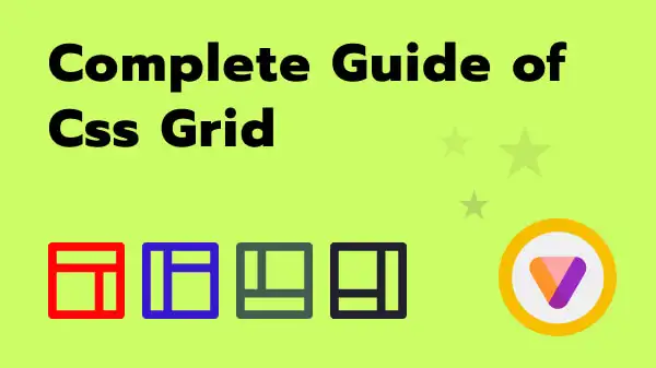
CSS Grid is the right tool once a layout needs both rows and columns to line up together — page shells, dashboards, image galleries, pricing tables. The part that trips people up coming from Flexbox is that Grid defines the structure on the parent up front, rather than letting children negotiate space.
Defining the grid
grid-template-columns sets up the column tracks. 1fr 1fr 1fr gives three equal columns; 200px 1fr gives a fixed sidebar next to a fluid content area. gap replaces the old margin-hack spacing between grid items.
The auto-fit + minmax trick
This is the one pattern that removes most manual breakpoints: grid-template-columns: repeat(auto-fit, minmax(240px, 1fr)). The browser fits as many 240px-minimum columns as will fit the row, and stretches them to fill the remaining space — a responsive card grid with zero media queries.
Placing items explicitly
grid-column and grid-row (or named grid-template-areas) let a specific item span multiple tracks — useful for a featured card that should take up two columns while the rest stay single-width.
.gallery {
  display: grid;
  grid-template-columns: repeat(auto-fit, minmax(240px, 1fr));
  gap: 24px;
}

.gallery .featured {
  grid-column: span 2;
}
Grid and Flexbox aren't competitors — most real interfaces use Grid for the page shell and Flexbox inside individual components like cards and nav bars.
← back to all writingMuhammad Shahzaib
Frontend Developer
React & Next.js
TypeScript
Tailwind CSS
Muhammad Shahzaib
SaaS dashboards
Shopify themes
GSAP & Framer
Muhammad Shahzaib
ShadCN UI
RTL & i18next
Figma to UI
Muhammad Shahzaib
4+ years
Vistothemes
Freelance UI
Muhammad Shahzaib
Remote work
pixel-perfect
Muhammad Shahzaib
Frontend Developer
React & Next.js
TypeScript
Tailwind CSS
Muhammad Shahzaib
SaaS dashboards
Shopify themes
GSAP & Framer
Muhammad Shahzaib
ShadCN UI
RTL & i18next
UI-only scope
Muhammad Shahzaib
your mockups
production UI
Muhammad Shahzaib
Muhammad Shahzaib
Frontend Developer
React & Next.js
TypeScript
Tailwind CSS
Muhammad Shahzaib
SaaS dashboards
Shopify themes
GSAP & Framer
Muhammad Shahzaib
ShadCN UI
RTL & i18next
Figma to UI
Muhammad Shahzaib
4+ years
Vistothemes
Freelance UI
Muhammad Shahzaib
Remote work
pixel-perfect
Muhammad Shahzaib
Frontend Developer
React & Next.js
TypeScript
Tailwind CSS
Muhammad Shahzaib
SaaS dashboards
Shopify themes
GSAP & Framer
Muhammad Shahzaib
ShadCN UI
RTL & i18next
UI-only scope
Muhammad Shahzaib
your mockups
production UI
Muhammad Shahzaib
Muhammad Shahzaib
Frontend Developer
React & Next.js
TypeScript
Tailwind CSS
Muhammad Shahzaib
SaaS dashboards
Shopify themes
GSAP & Framer
Muhammad Shahzaib
ShadCN UI
RTL & i18next
Figma to UI
Muhammad Shahzaib
4+ years
Vistothemes
Freelance UI
Muhammad Shahzaib
Remote work
pixel-perfect
Muhammad Shahzaib
Frontend Developer
React & Next.js
TypeScript
Tailwind CSS
Muhammad Shahzaib
SaaS dashboards
Shopify themes
GSAP & Framer
Muhammad Shahzaib
ShadCN UI
RTL & i18next
UI-only scope
Muhammad Shahzaib
your mockups
production UI
Muhammad Shahzaib
Muhammad Shahzaib
Frontend Developer
React & Next.js
TypeScript
Tailwind CSS
Muhammad Shahzaib
SaaS dashboards
Shopify themes
GSAP & Framer
Muhammad Shahzaib
ShadCN UI
RTL & i18next
Figma to UI
Muhammad Shahzaib
4+ years
Vistothemes
Freelance UI
Muhammad Shahzaib
Remote work
pixel-perfect
Muhammad Shahzaib
Frontend Developer
React & Next.js
TypeScript
Tailwind CSS
Muhammad Shahzaib
SaaS dashboards
Shopify themes
GSAP & Framer
Muhammad Shahzaib
ShadCN UI
RTL & i18next
UI-only scope
Muhammad Shahzaib
your mockups
production UI
Muhammad Shahzaib